Groupon Merchant Center dashboard redesign
Redesigned dashboard modules on mobile and desktop viewports.
Context
Business owners with deals on the Groupon platform have access to Merchant Center, an online portal where they can manage their deals, make changes, and track performance.
Problem
The previous Merchant Center dashboard didn’t promote discovery and exploration. Vision work was shared with merchants of part of a user study the prior year, and participants responded positively to the new designs.
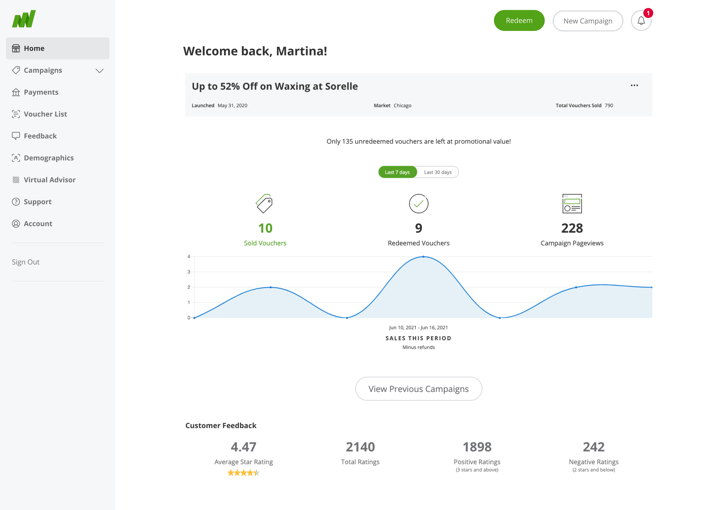
Screenshot of previous dashboard, with performance and customer feedback modules shown.
Goal
Leverage the vision work and reference the user research study to modernize the dashboard, making key performance metrics more discoverable, and promoting deeper engagement with Merchant Center.
Designs from vision work.
Competitive analysis
When auditing the competitive landscape, I focused on other experiences that included seller dashboards or similar data visualization UI. It proved challenging to find examples with real data so I had to get creative about sourcing these.
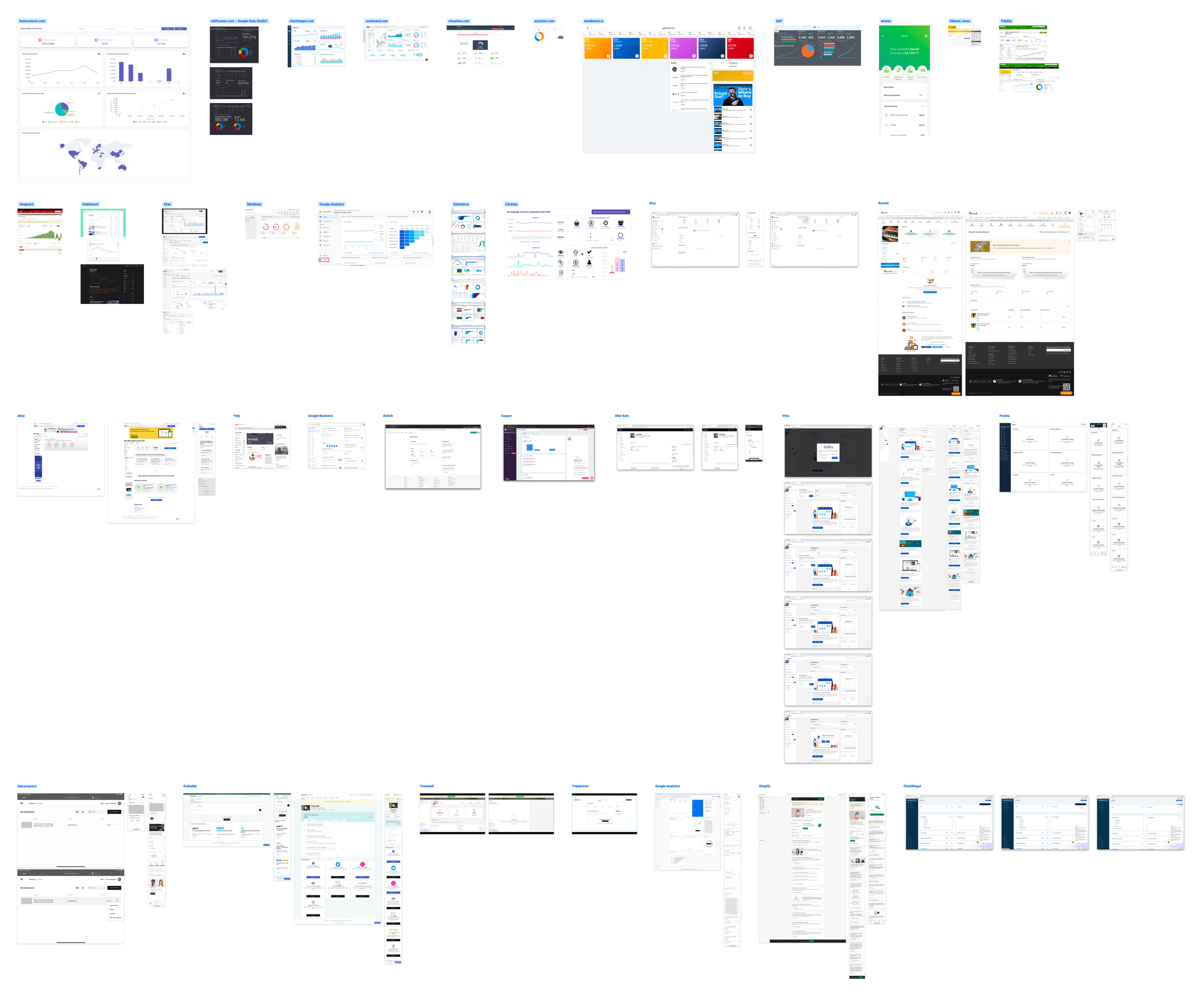
Screenshots from competitive analysis.
Scope
My early explorations featured a dashboard that displayed key insights and recommendations in context with the data. Merchant Center had a product called Virtual Advisor that already offered these kinds of tips. Integrating with Virtual Advisor would greatly increase the scope and jeopardize the project timeline. As such, my product partner and I designated these insights as post-MVP enhancements.
We worked together to narrow the scope down to the areas that had the most impact during the research study. Our MVP would include the following three dashboard modules:
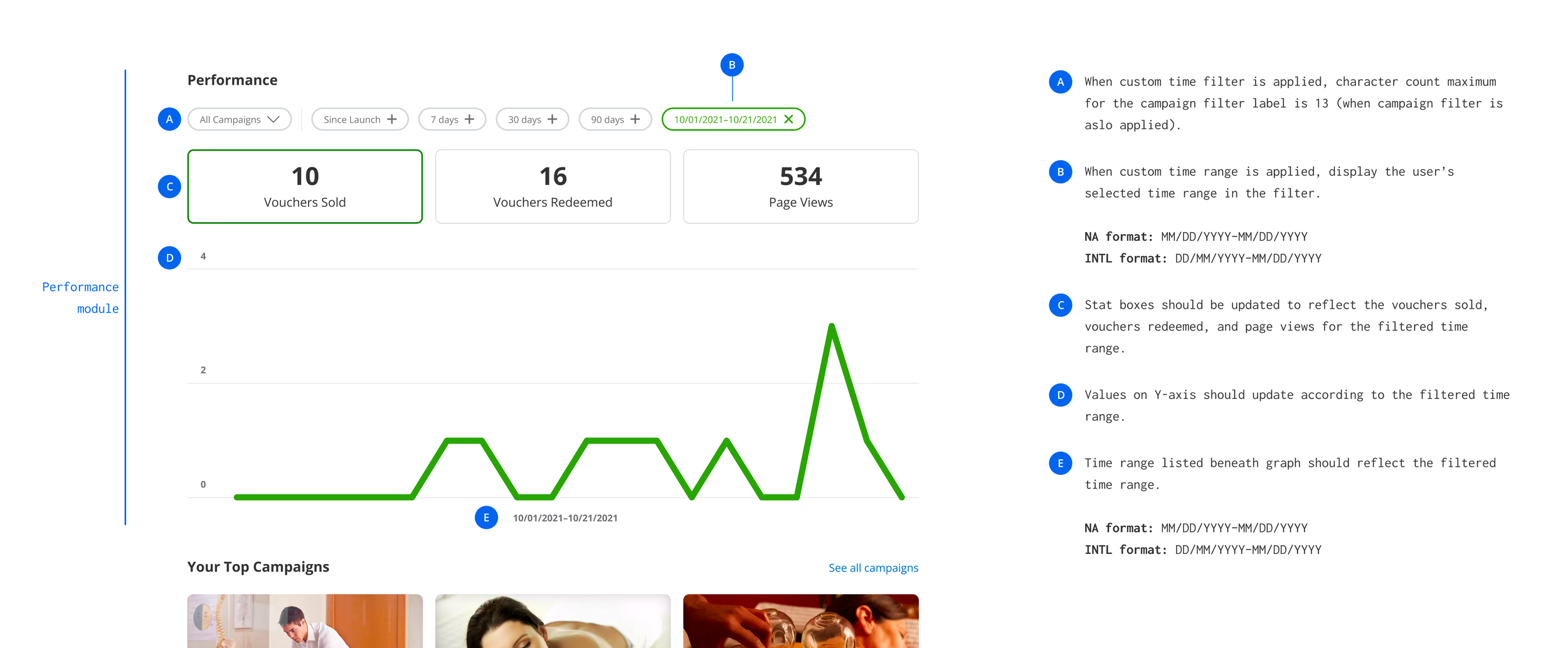
Performance metrics
Top performing deals
Customer feedback
Iteration
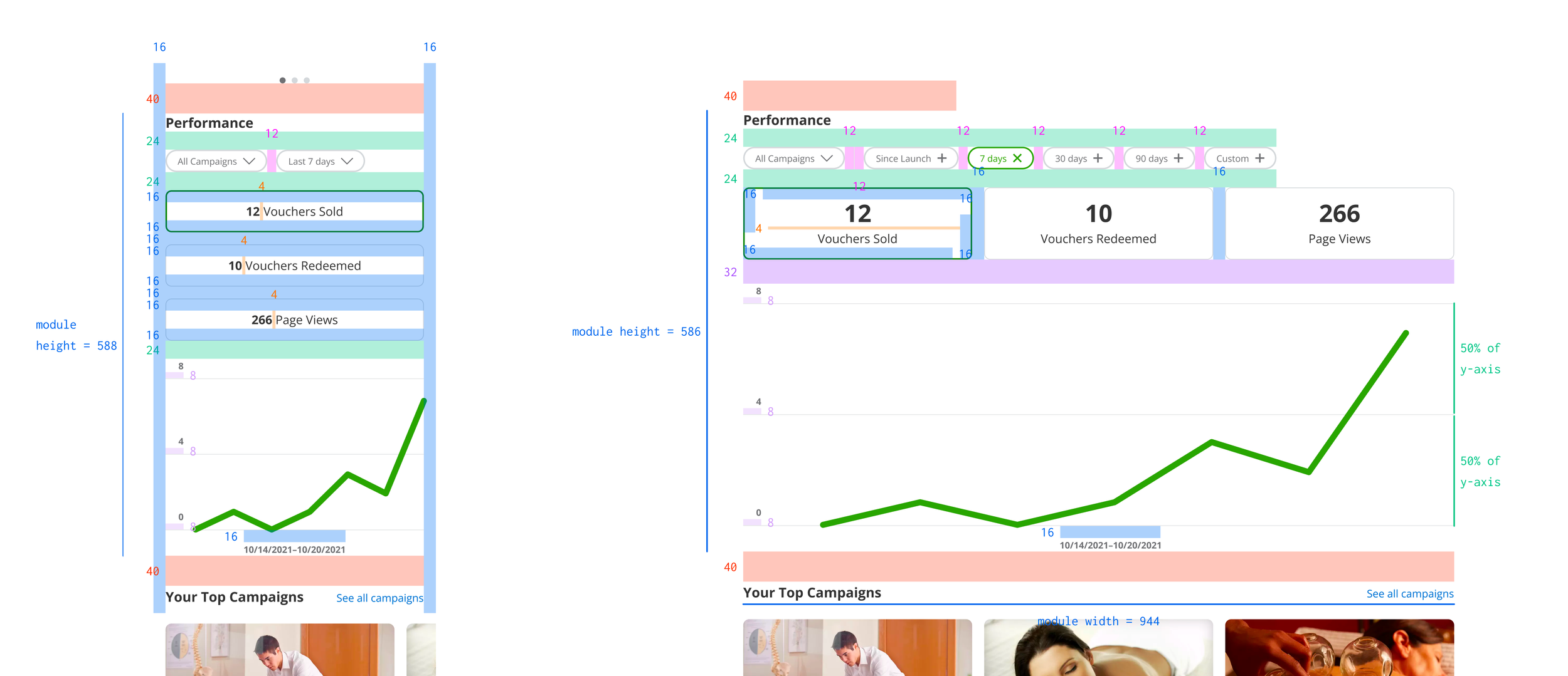
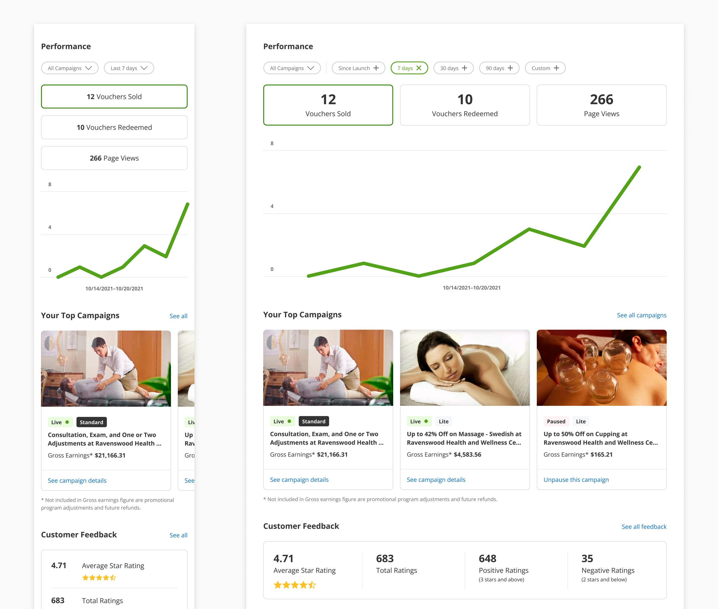
Iterating the performance tiles and graph
Using the vision work as a starting point, I explored different ways of presenting the information. My goal was to emphasize the metrics and find a better balance with the graph.
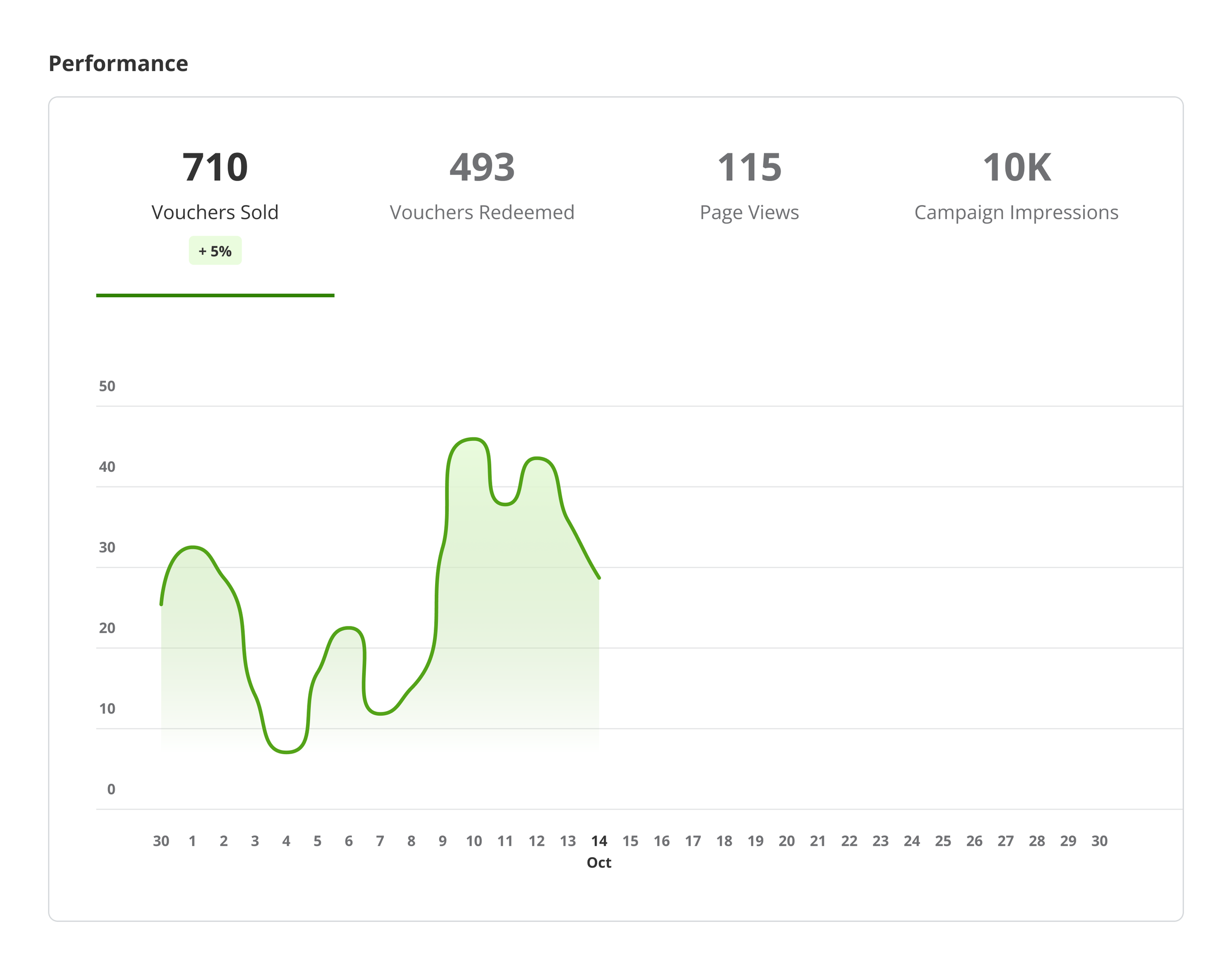
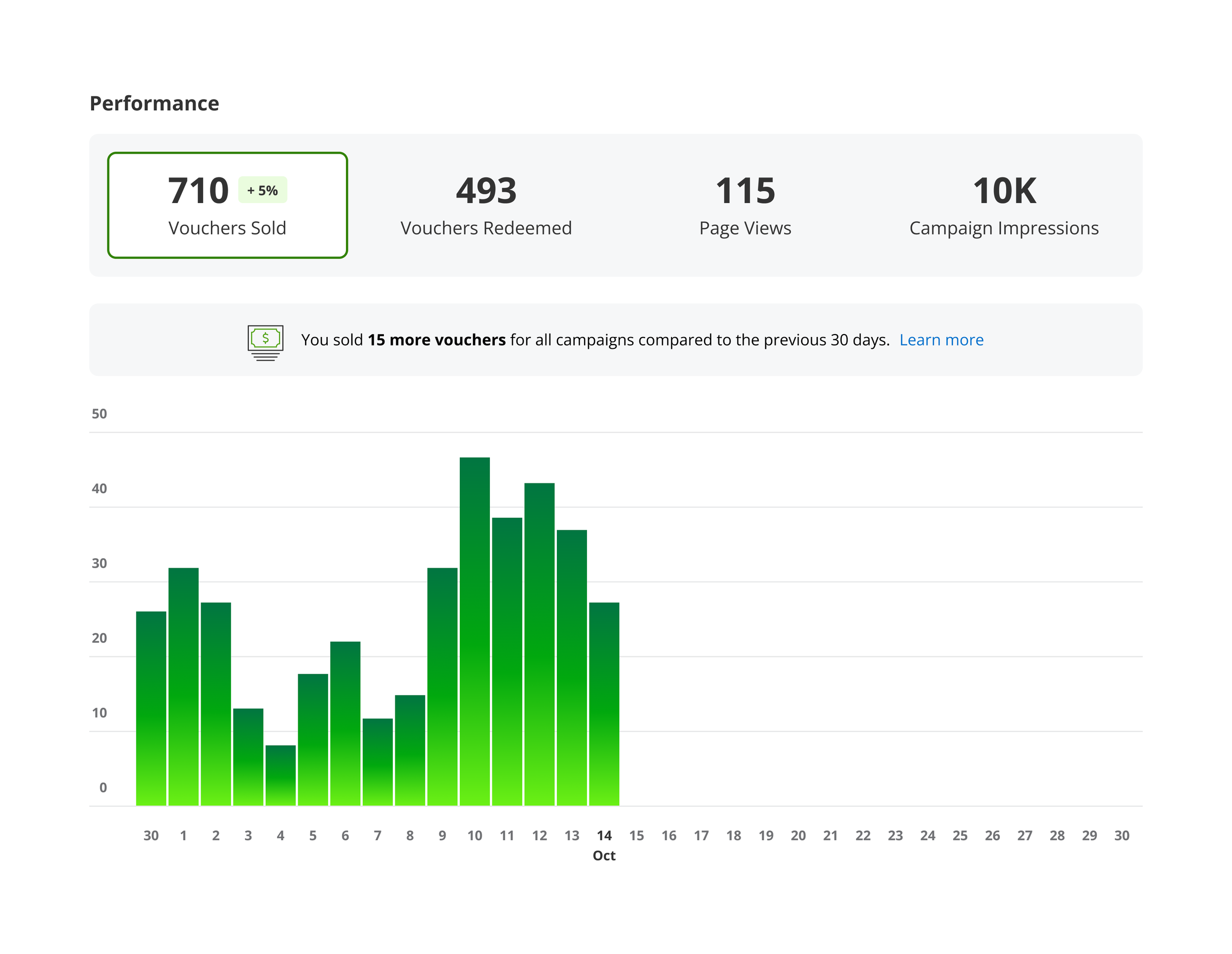
I also explored the possibility of displaying page views and campaign impressions as read-only metrics, and not charting them on the graph. Only the vouchers sold and redeemed would be interactive in this example.
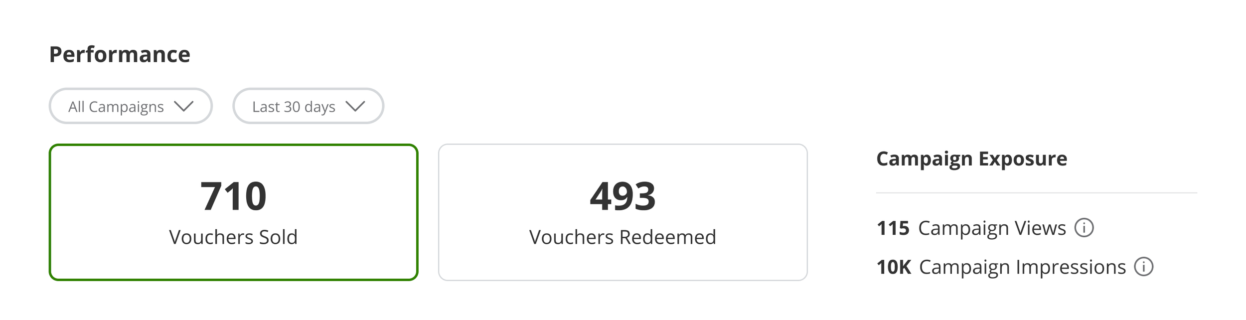
Iterating the filters
I went through several iterations of the campaigns filter, ultimately aligning to a pattern I uncovered when auditing the merchant experience. Ideally the time range filter would behave the same way, but exposing the time ranges made it more likely that a merchant would notice them.
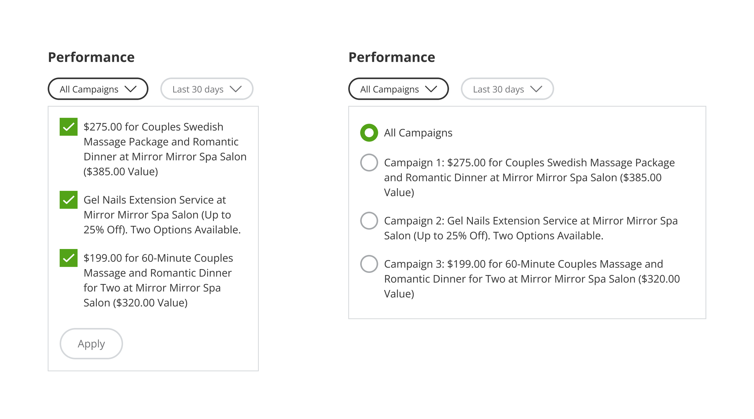
Checkbox selection allows for selecting multiple campaigns to compare, whereas a radio selection aligned to similar filters in Merchant Center.
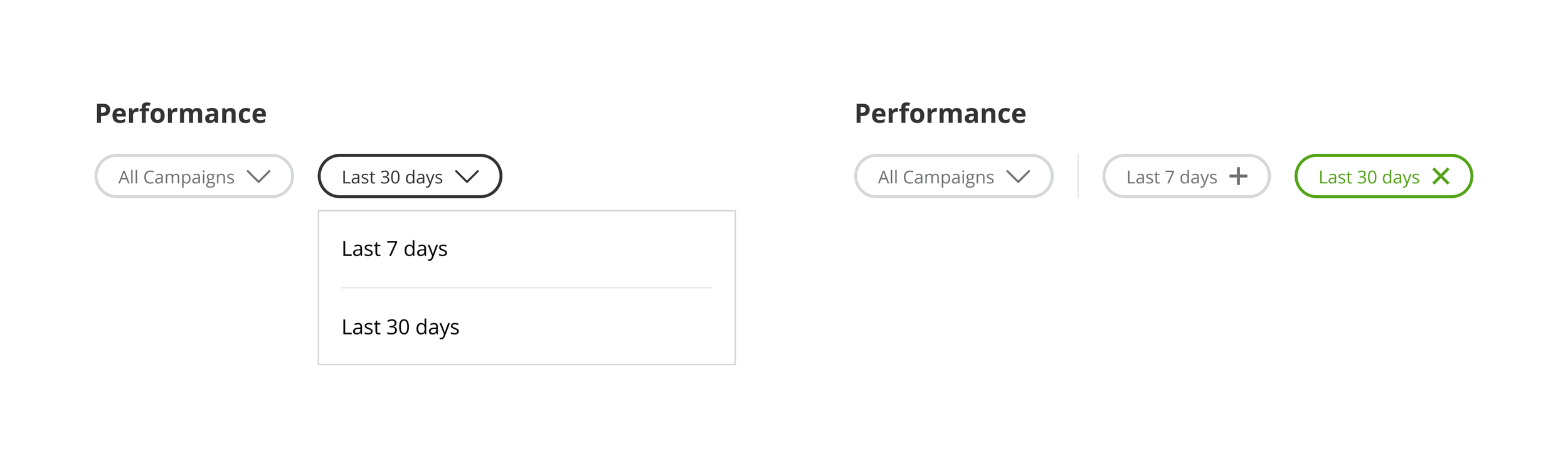
Time range filter that uses a dropdown for consistency with the campaigns filter, or exposed time range filters for greater visibility?
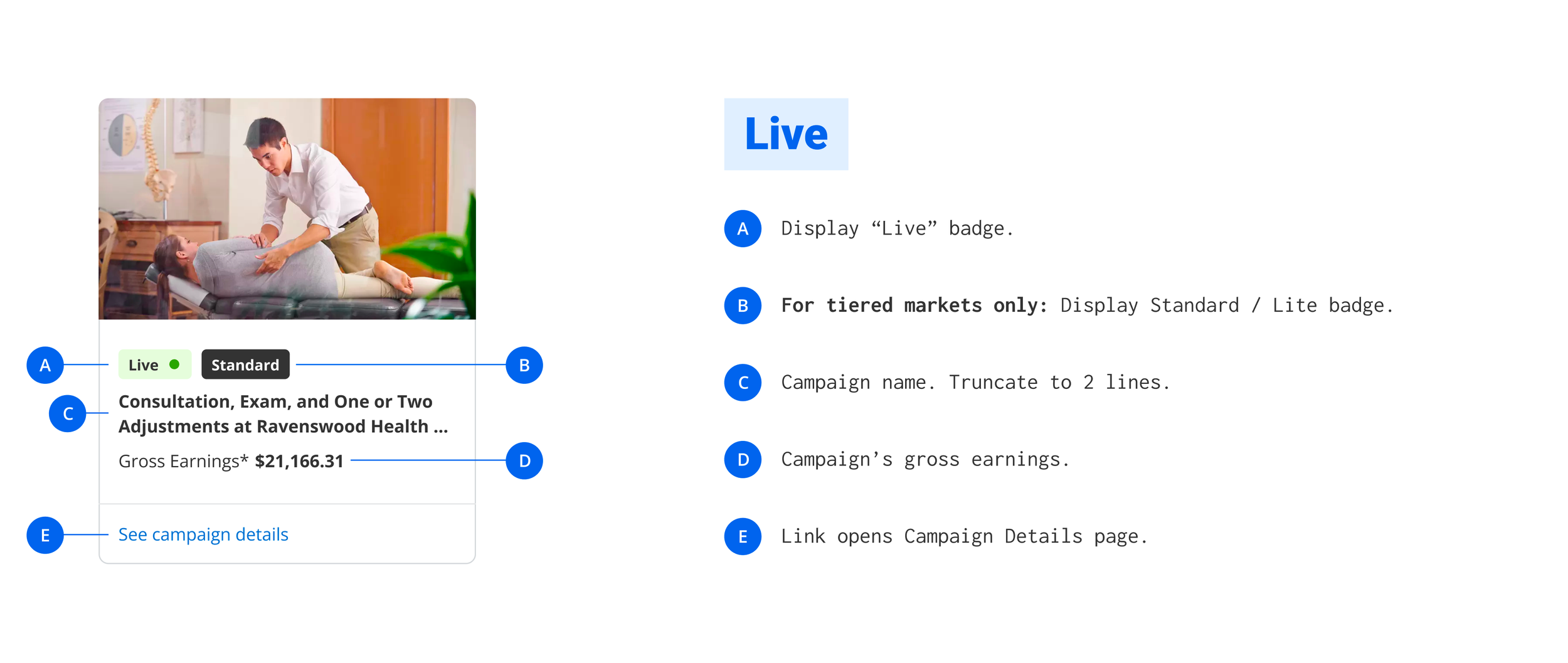
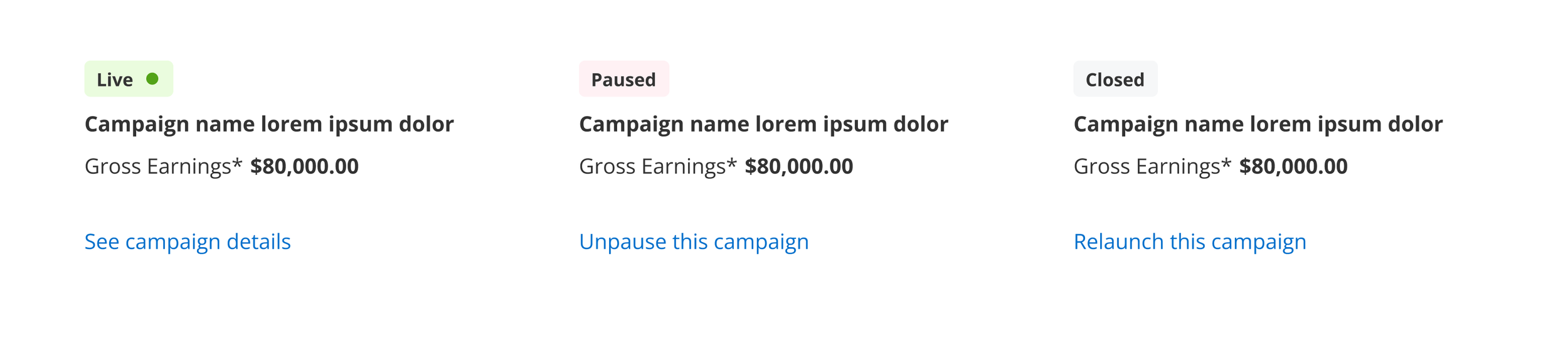
Iterating the top campaigns module
The top campaigns module would be a new addition to the Merchant Center experience. I again used the vision work as a foundation to build on, exploring card treatments for each campaign.
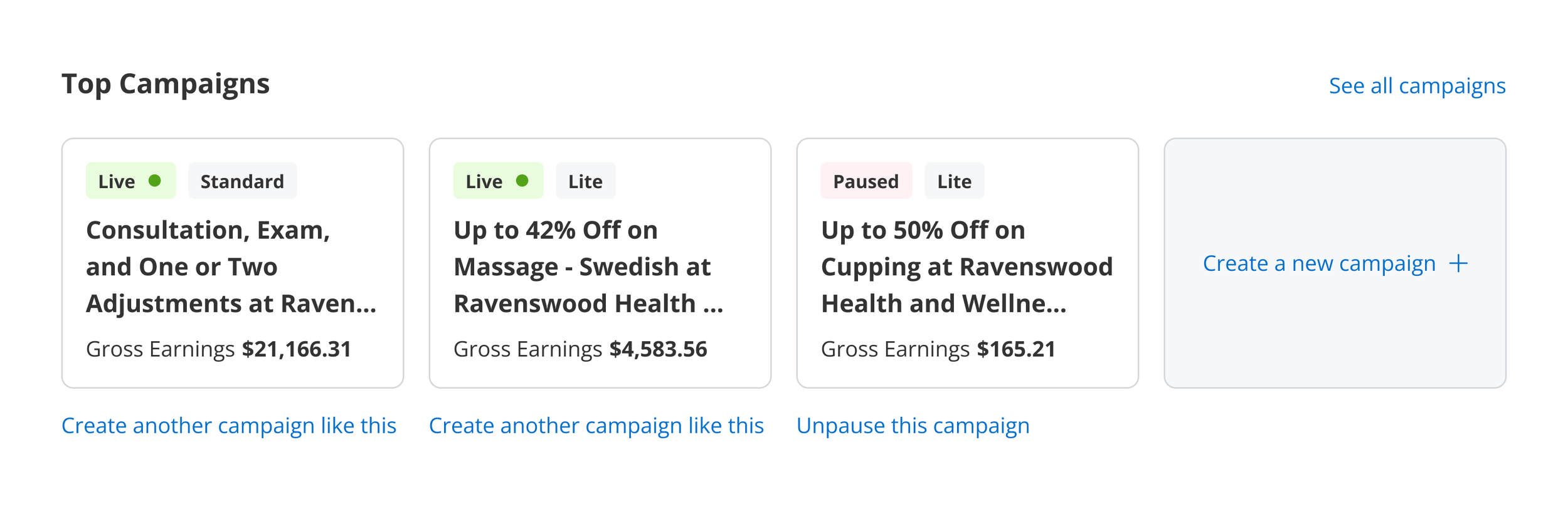
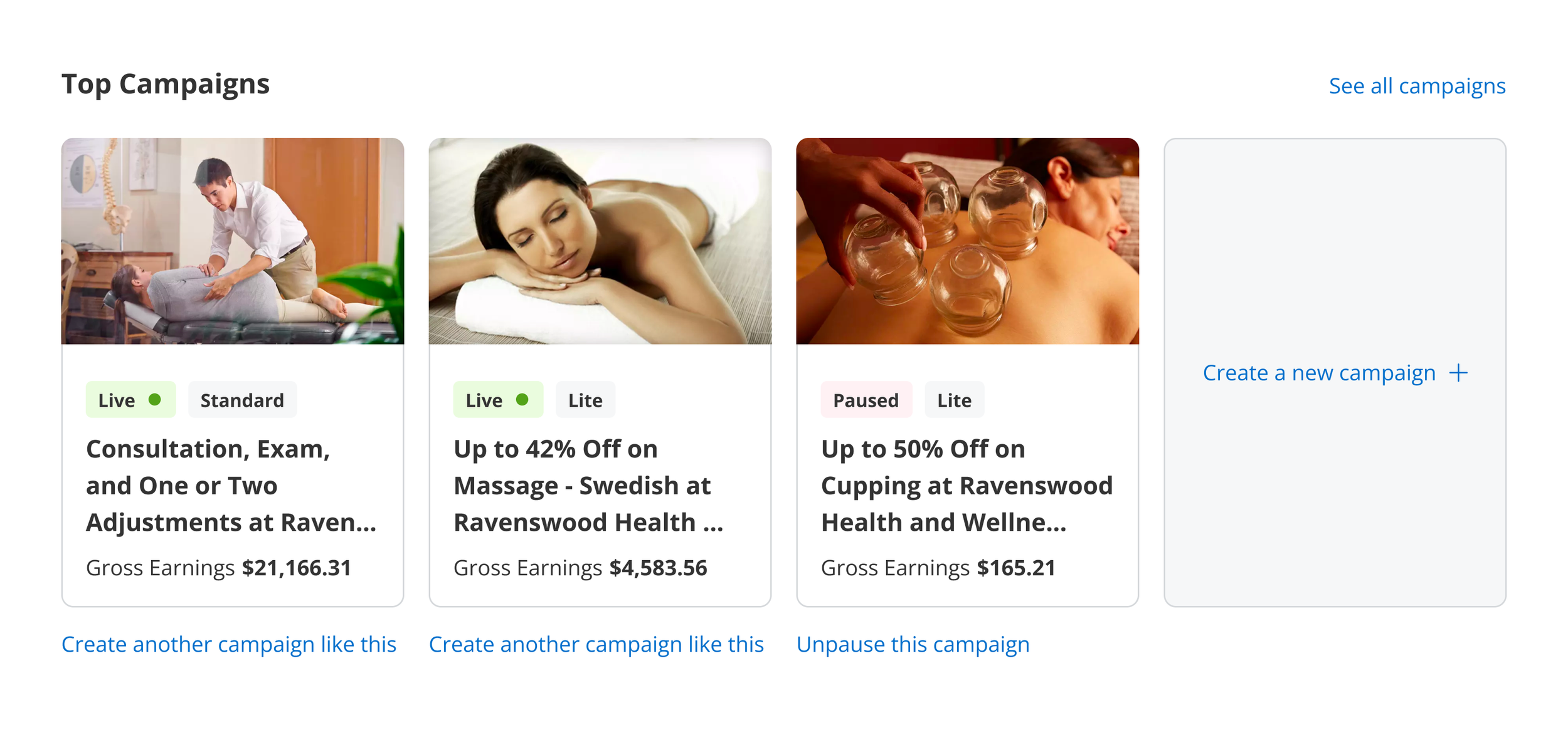
While considering the layout, I also examined the different statuses a campaign can have in Merchant Center, and explored the most appropriate action for each. These actions are designed to guide users into the self-service experience that makes the most sense for their campaign, while driving engagement with Merchant Center.
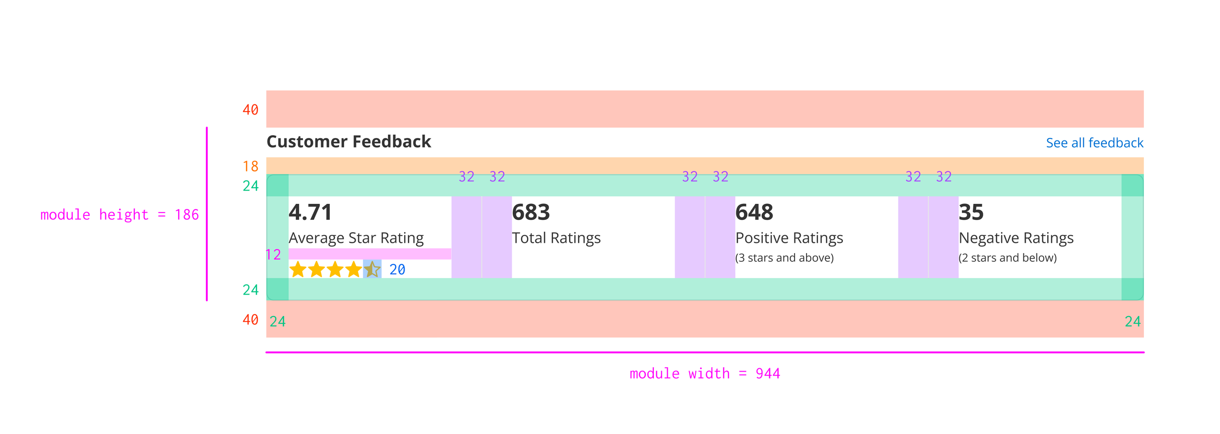
Iterating the customer feedback module
In order to stay on track for delivery, my product partner and I agreed that updates to the customer feedback module would be limited to UI only. There would be no new functionality introduced as part of our MVP. With that in mind, I explored updates that would give the customer feedback module more visual consistency with the other updated modules on the dashboard.
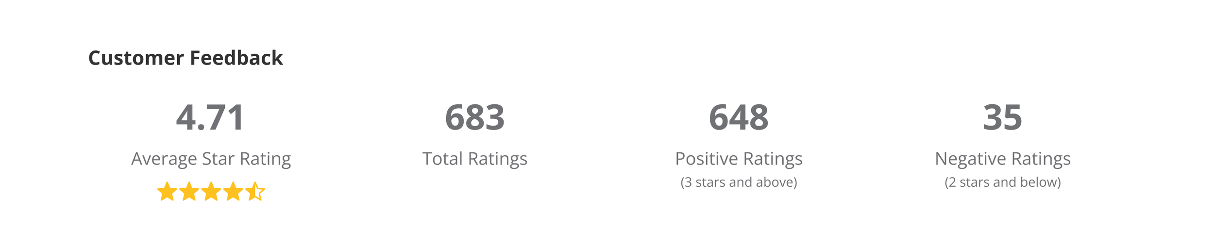
Feedback module, before.
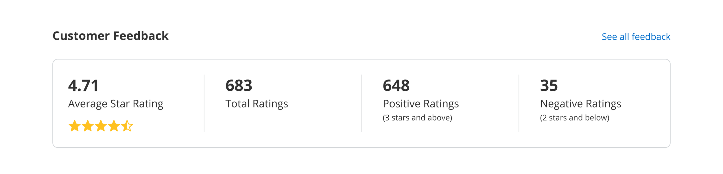
Feedback module, after.
Delivery
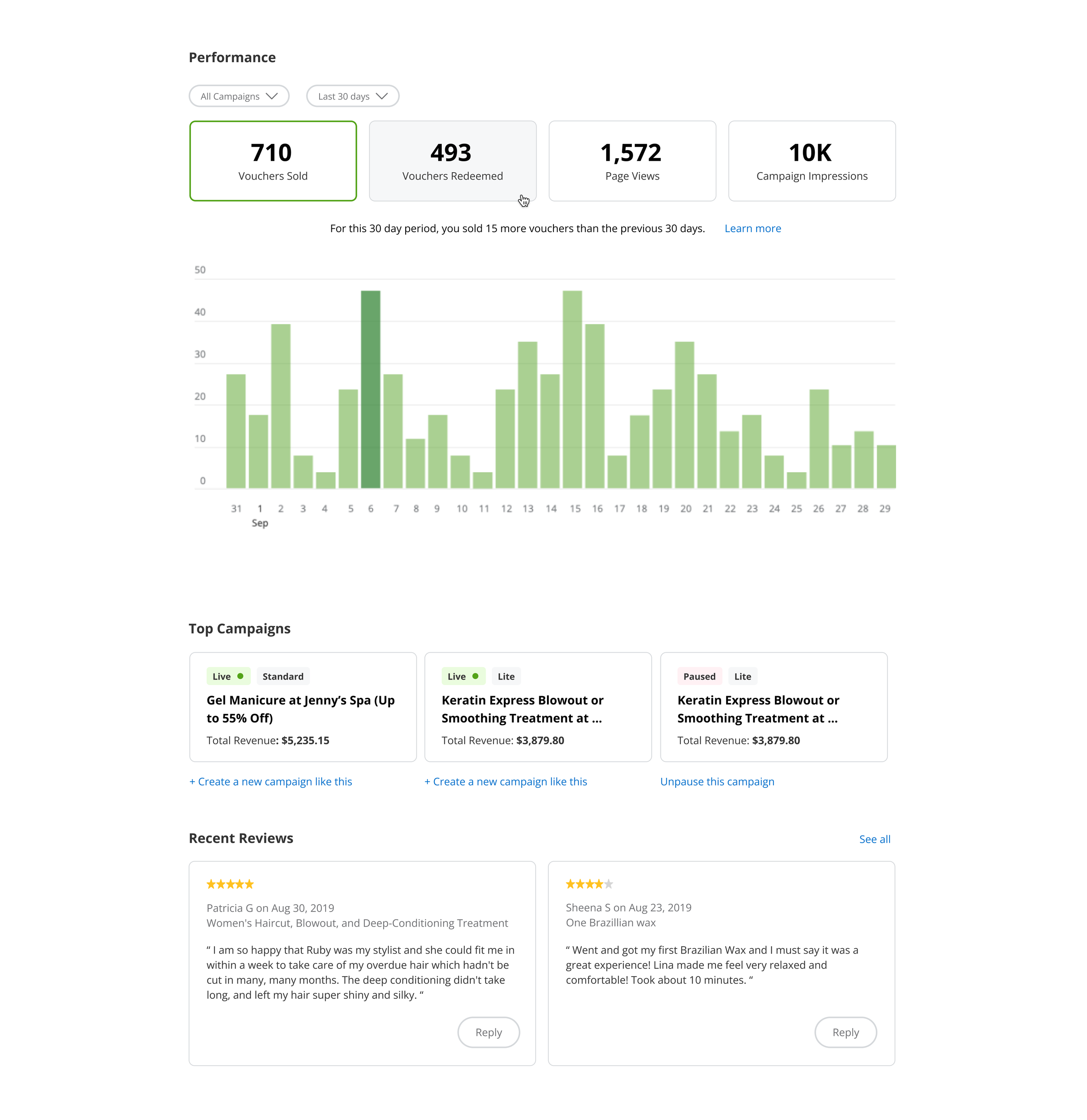
I provided a full set of functional specifications with spacing guides to engineering. Samples below.